This month, at the shop, we were reflecting on our previous website builds, and we thought it would be great to share these projects with our audience. We decided to write up a summation highlighting three different builds, and why they stand out. Fidelis always creates our websites from scratch with no templates. On these builds, our team got to branch out into industries ranging from luxury hospitality and premium professional services, to land development and community events. These projects enabled us to display the breadth of our skill, experiment with fun, motion elements, and employ unique design features that we don’t often use. So, here’s more about each of these projects and the work we did to help our clients look right, sound great, and drive revenue.
Sol and Luna
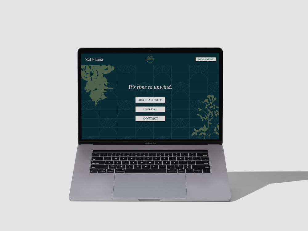
Sol & Luna is a project that notably stands out from the past few years. Giving us full creative and strategic freedom, we’re grateful to the Sol & Luna team for letting us help build everything for their brand–starting at the very foundation with the process of developing a name for the entire project.
Since Sol & Luna is for friends, families, and couples alike, we wanted to build them a name that clearly presented the diversity and assortment that these charming vacation casitas offered. The name Sol & Luna was chosen because it perfectly balances the dichotomy of playing and of resting. Both describe a warm, relaxing, daytime vacation as well as a chill, unique night out.
Wanting to further develop this brand, our team jumped at the chance to adorn the visual identity and website with botanical illustrations, ornate patterns, and simple one-liners that speak to the attitude of enjoyment.
But even after developing the brand voice, the name, and the visual identity, nothing brought these elements together like the website. Capturing the essence of joy, warmth, and relaxation that the brand embodies, the website tied together all of the elements that we were able to present to Sol & Luna. Developing soft color transitions, subtle animations, and using Clara Rummel’s poem, a major inspiration throughout this project, we helped Sol & Luna build a unique and exciting brand.

Lake Walk
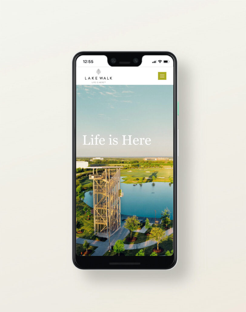
When the executive team at Lake Walk announced that they were in need of a new web presence to communicate the quality, vision, and future plans for their thriving development we were thrilled to join the project. Having been a part of the expanding BCS community for several years, we were more than excited to have the opportunity to be part of this new project.
The website needed to show the full range of offerings and deeply connect with the young talent being courted by Boston or San Francisco research centers. Why Texas?! Lake Walk offers unique networking opportunities, restaurants, and living environments to bright young minds, and the website had to reflect that. Since the nexus of work, social, and quality of life is more important than ever; that was the focus of Lake Walk’s new web presence. Potential tenants had to be able to ‘see themselves living at Lake Walk’ which is a tall order for a website in the 21st century. Since viewers can bounce around pages all day long, the pages we built had to ‘show’ as well as ‘tell’ young talent that their future is brighter under a Texas sky. We’re proud of how it turned out and thrilled that we might have a small part to play in bringing the best minds to our town. Bryan-College Station will be better for it.

West Webb Allbritton & Gentry
West Webb Allbritton & Gentry guides businesses and individuals through legal processes across Texas. With offices in 5 Texas cities, they are continually expanding their capacity to serve the people of Texas with a variety of legal offerings. Their customers see them as part of their businesses and families, trusted guides to navigate rocky seas.
West Webb Allbritton & Gentry first approached us looking for guidance into their future, despite having been established in Texas for over 40 years. Hoping to further strengthen their brand foundation as they continue to expand, they decided to undergo a Brand Discovery Workshop and to nail down a fresh vision and message that all 45+ members of their team could rally around.
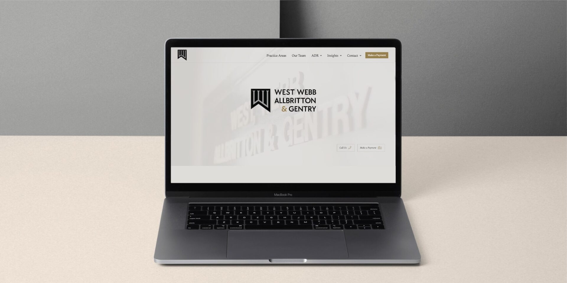
Having established that fresh vision, the next step was to build. Equipped with a new visual identity and a website built from the ground up, West Webb Law now matched the high-level of integrity and excellence at which they operate. Choosing to exclusively use matte black, silver, and gold coupled with sharp serif fonts, their brand now shows itself off as capable and professional. With clean sections, bold headlines, and clear navigation, the website thematically follows their brand. With bright headshots providing warmth and speaking to the team’s compassion and dedication to serve Texas businesses and families.
With each of these brand elements in place, they are poised for a new season of growth as their reputation and expertise continue to grow across the State of Texas.

Do you need help
talking to your
perfect clients?